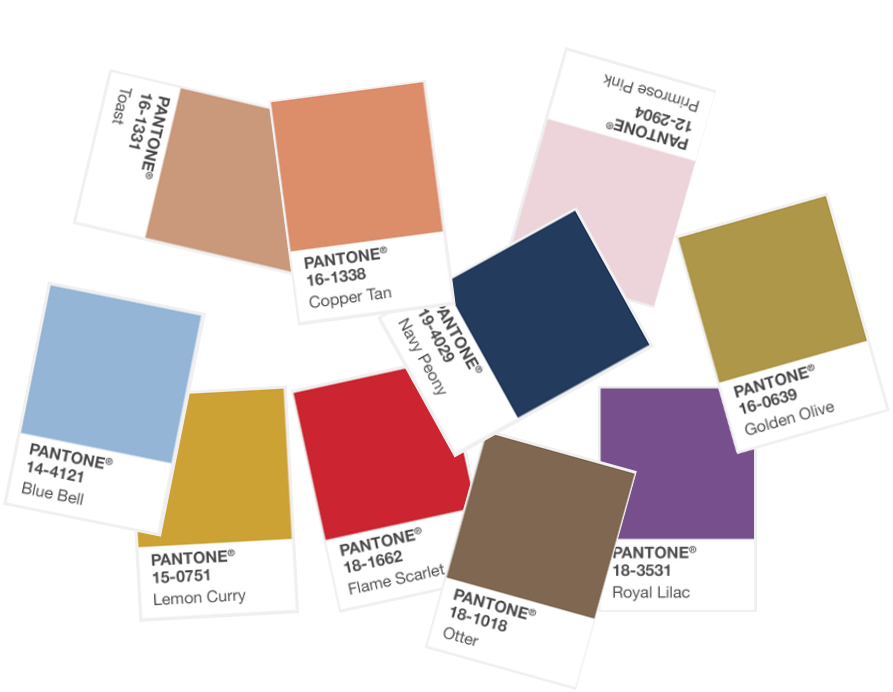
Pantone’s 2017 Fall Colour Palette for London is a strong one, with bright Flame Scarlet taking the lead along with warm classics like Copper Tan, Toast and Primrose Pink. The punchy Lemon Curry and opulent Royal Lilac create a unique colour palette to inspire design this coming Autumn 2017. We have chosen our favourite colour pairings to demonstrate how to use Pantone’s 2017 Fall Colours in interior design.
The ability to customise London Essentials furniture eases the process of finding the right sofa, armchair or headboard in that exact Pantone shade you wish for your home. Read on to discover our recommendations for the shapes and textures to work with for some of these exciting hues.
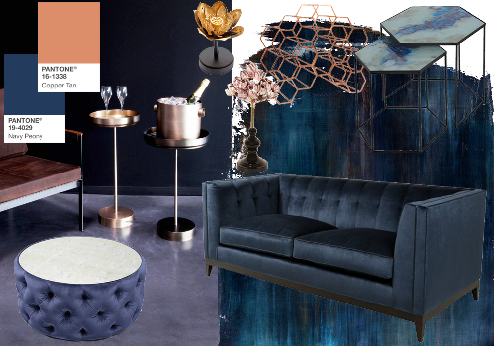
Navy Peony + Copper tan
Navy is here to stay in interior design with Pantone’s strong Navy Peony tone. This deep neutral is ideally used in soft materials such as velvet sofas and ottomans, particularly with details such as tufting an deep buttoning. Alternatively, go bold with a deep and sophisticated navy coloured wall in a living room or bedroom.
This midnight shade contrasts wonderfully with the warm Copper Tan shade for a stylish accent. Choose metallic details and accessories to lift the Navy Peony colour. The entire London Essentials copper cocktail accessories range taps into this Pantone trend beautifully. Decorative pieces like the Lotus Flower and Sea Begonia Tree add a delicate touch in warm gold and blushes to achieve a similar warm and autumnal look.
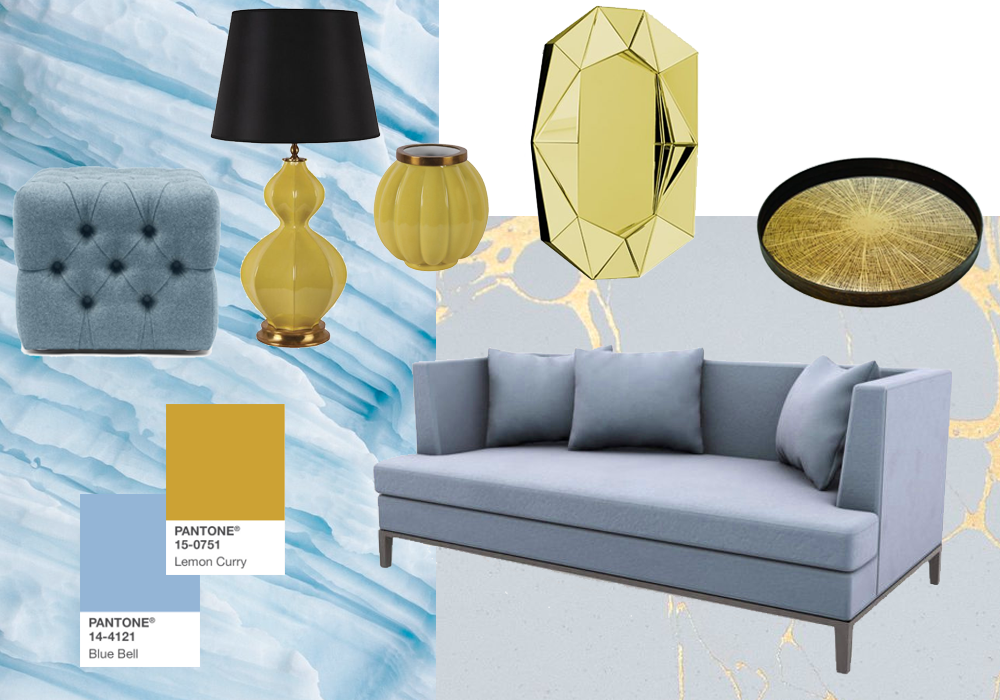
Blue Bell + Lemon Curry
The zingy pairing of Blue Bell and Lemon Curry creates an eye-arresting interior scheme that takes you through a tranquil blue winter into a lively spring. Use the on-trend powdery Blue Bell on more modern larger pieces such as an armchair or sofa with clean lines.
Add the warm and zesty Lemon Curry through accessories such as vases, trays, and lighting. The London Essentials Yellow Femvelar Vases and Lamps are the perfect tone to vivify the peaceful Blue Bell shade.
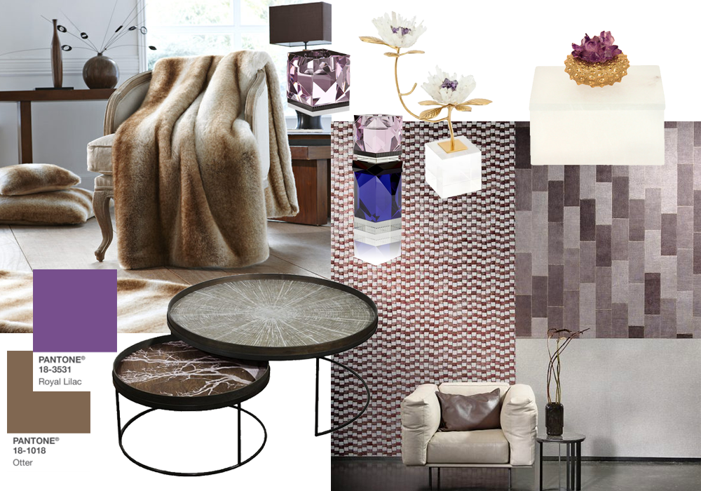
Otter + Royal Lilac
The earthy Otter colour grounds an interior while the rich Royal Purple shade provides a theatrical and opulent touch. Royal Purple works beautifully with the crystal trend, bringing a dash of luxury through crystal accessories like vases or candleholders.
The cosy and natural Otter colour juxtaposes wonderfully with this luxurious style and is beautiful for the autumn/winter seasons. Try using natural style textures like faux fur throws and wood textured tray tables. Arte wallcoverings are also available in a range of natural textures and shades which work perfectly with this atmospheric and narrative interior scheme.