Down to Earth
Things are heating up for spring and summer 2017 and also in terms of colour in interior design. Earthy tones are increasingly prevalent and offer an uplifting mood within a room. Similar to the Pantone green colour of the year and the increase of plants in the home, earthy hues connect to a longing to get back to nature. The earthy colour palette is about embracing slower and more sustainable living, and being conscious of choices.
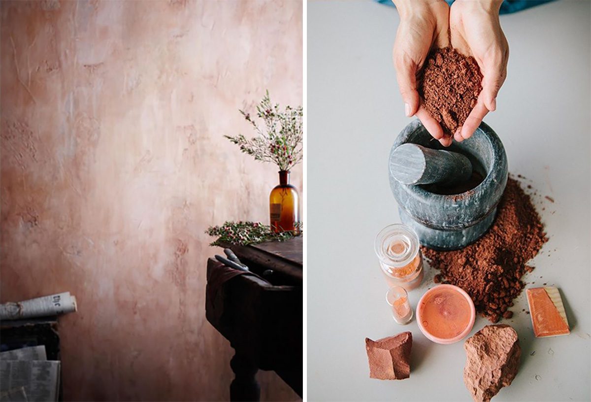
This colour scheme draws from a palette taken from natural rocks, deserts, earth and trees featuring pale rose, peach, cinnamon, tan, ochre, burnt orange, burgundy and terracotta.
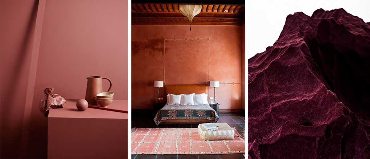
Terracotta + burgundy
Surprisingly these hues are very adaptable to any interior scheme. Choose from a bold look with a terracotta wall, or perhaps simply warm up a room with a few accessories. Do not be afraid to go bold with a deep bronze rug, sofa or feature wall that looks cosy in the winter and exotic in the summer.
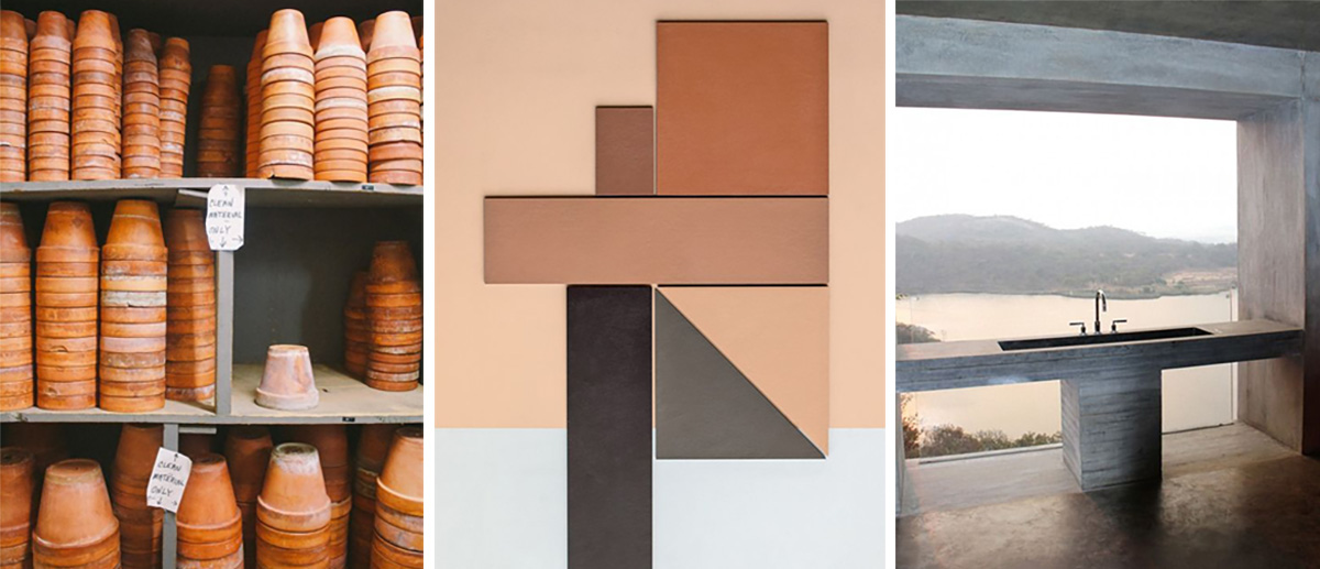
Burnt orange + rust
Select large pieces such as warm wooden furniture to make an impact. For example the round Lincoln Dining Table in beautiful Pau Ferro wood. The Lincoln Table’s wood grain radiates out from the middle creating a beautiful centre point in a room. To add contrast and cool down this style, add splashes of teal or cerulean to transport your interior straight to Moroccan souks.
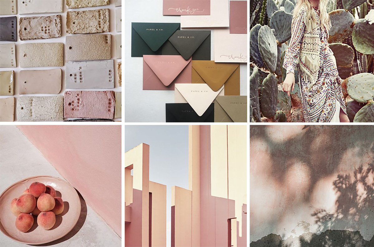
Peach + rose + blush
Take this on-trend warm shade of pale pink and combine with sage or ochre to keep it more earthy and less feminine. Porcelain is an authentic way to merge the earthy trend into an interior, because many of the colours come from clay earth pigments such as sienna and umber. The porcelain Shell Bowl and Plate are beautiful as well as practical and make perfect fruit or serving dishes. The dishes’ coral tones add a splash of colour, with the regal brass details in the shapes of seahorses or shells adding a sophisticated touch.
Sage + emerald
Cool greens taken from moss, sage, and emerald contrast stunningly against warm terracotta. Choose marble textures such as the Bordo Marble Plate in Small or Medium, and the Loki Tray. Deep emerald greens also beautifully freshen up pink hues such as blush and peach.
Taupe + cinnamon
Earthy colour schemes translate extremely well to décor in rustic shapes; think imperfect, handmade, irregular and natural materials. Combine shiny and smooth metallic or glass with rough textures for beautiful contrast in natural colours. The Sami Lantern combines mouth-blown glass with hand-carved wood in honey and tan colours, providing a warm glow when lit. Another hand-blown piece is the Boco Lamp in Havana, in a burnt orange tone, which is a poetic pendent lamp. The design uses the glass in a playful way that makes it appear malleable and contrasts exquisitely with natural cord. The handcrafted nature of both of these items means each design varies in colour and finish, which adds character and makes each piece truly unique.
This appeal for deeper and warmer interiors is a timeless approach to style. As explored, this earthy colour scheme is broad and can be applied to many areas of the home and lifestyle. Toasted colours are authentic and relate well to glass, wood, textiles, metal, ceramics and more. Combined with handmade elements and tactile materials, these tones create an elegant and luxurious ambiance for the senses.
Image Sources: Moodboard one: 1, 2, Moodboard two: 1, 2, 3, Moodboard three: 1, 2, 3, 4, 5, 6. Moodboard four: 1, 2, 3.